
How to Create a Star Rating Component using React

I am a creative Front-End Developer who enjoys creating beautiful User-Interfaces with excellent User Experience. I also enjoy writing about things I learn, challenges I face, solutions, etc.
Introduction
Rating is common in websites, web applications, and mobile applications. It is used to get feedback from users about how they feel about your app.
For this article, we will be building a star rating component for an application.
Time to Get our Hand's Dirty
Step 1
Create the Ratings component i.e. Ratings.jsx
We will be using the Rating Component from Material UI for our stars.
You can check out the Material UI Documentation
import React, { useState } from "react";
import Rating from "@mui/material/Rating";

const Ratings = () => {
  return (
    <div className="rating">
      <Rating name="size-large"
       size="large"
       />
    </div>
  );
};
export default Ratings;
Note: The name ="size-large" and size="large" are both Material UI styles to increase the size of the stars. Your Ratings Component would look like this.
When you hover you will get a yellow background.
 Note: I added the blue background using css.
Step2
Use React UseState hook to store the value of our Rating.
The initial state of our star rating is 0.
where ratingvalue is the state and setRatingValue is the function that update's the state
const [ratingvalue, setRatingValue] = useState(0);
Step3
Give the rating component a value property equal to our state 'ratingvalue'. Also, give it an onChange event handler to detect change in the rating value. Then attach the setRatingValue function which passes the value of the rating.
const Ratings = () => {
  const [ratingvalue, setRatingValue] = useState(0);
   return (
    <div className="rating">
      <Rating
        name="size-large"
        size="large"
        value={ratingvalue}
        onChange={(event, value) => {
         setRatingValue(value);
        }}
      />
    </div>
  );
};
export default Ratings;
Step4
Use the ternary operator to toggle between the values and provide the appropriate feedback to our user-interface
import React, { useState } from "react";
import "./styles.css";
import Rating from "@mui/material/Rating";

const Ratings = ({ open, close }) => {
  const [ratingvalue, setRatingValue] = useState(0);
  return (
    <div className="rating">
      <Rating
          name="size-large"
          size="large"
          value={ratingvalue}
          onChange={(event, value) => {
          setRatingValue(value);
        }}
     />
      {ratingvalue === 0 ? (
        <p className="text">Please rate us</p>
      ) :
         ratingvalue < 5 ? (
        <div className="feedback">
          <p className="text">What went wrong ?</p>
           <button className="btn">user-experience</button>
           <button className="btn">connection?</button>
        </div>
      ) :
        ratingvalue === 5 ? (
        <p className="text">Awesome!!!</p>
      ) : null}
    </div>
  );
};
export default Ratings;
From the code above we are checking the state of the ratingvalue, If the rating value is equal to zero then the feedback is "Please rate us" which is the default. If the ratingvalue is less than 5 the feedback is "what went wrong? is it user-experience or connection."; when the ratingvalue is 5 feedback is "Awesome!!!"
Step 5
We would create a new component and name it Modal.jsx. The Modal.jsx would serve as a parent for our Rating component. Then import the RatingsComponent to the Modal.jsx.
import React from "react";
import "./styles.css";
import Ratings from "./Ratings";

const Modal = ({ open, close }) => {
  return (
    <div className="modal">
      <Ratings />
      <img
        src="https://freesvg.org/img/close-button.png"
        alt="close_button"
        className="close"
      />
    </div>
  );
};
export default Modal;
We would give the Modal component two props namely; open and close. also, add an image that would serve as a closing button for our rating component in case you don't want to rate the app.
Step 6
In our App.jsx Import the Modal component.
Create a state for our modal and name it "open modal"
import React, { useState } from "react";
import "./styles.css";
import Modal from "./Modal";

const App = () => {
  const [openmodal, setOpenModal] = useState(true);

  const handleClose = () => {
    setOpenModal(!openmodal);
  };
  return (
    <div className="App">
      <Modal open={openmodal} close={handleClose} />
    </div>
  );
};
export default App;
Create a function and name it handleClose.The handleClose function would handle the closing functionality of our rating component. The handleClose function takes the setOpenModal function which sets the openmodal state to false.
Remember our Modal.jsx has two props; open and close. so we would assign the props "open" equal to the openmodal state and props "close" equal to the handleClose function.
Step 7
Go back to our Modal.jsx component
import React from "react";
import Ratings from "./Ratings";
import "./styles.css";

const Modal = ({ open, close }) => {
  return (
    <>
      {open ? (
        <div className="modal">
          <Ratings />
          <img
            src="https://freesvg.org/img/close-button.png"
            alt="close_button"
            className="close"
            onClick={close}
          />
        </div>
      ) : null}
    </>
  );
};

export default Modal;
Use the ternary operator to display our ratings and remember our state is true
const[openmodal,setOpenModal] = useState(true);
Give the image an onClick event to handle the close functionality.
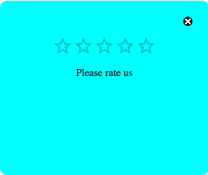
The Rating component would look like this
Conclusion
I hope you have learned how to build a rating component using React. Check out the complete source code on this Replit Happy Coding!!!


